Press Kit
Here you will find a listing of news releases and media resources from FASNY. You are encouraged to download and reproduce these news items. For more information on any news release, please email us at media@fasny.com.
For all other inquiries, please email fasny@fasny.com.
VERTICAL LOGOThe vertical version logo should be used in
|
||||
HORIZONTAL LOGOIn some instances a horizontal version of the logo Points to NOTE
|
||||
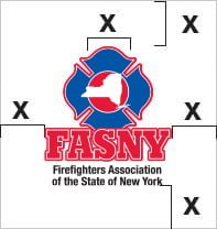
CLEAR SPACEAn important element in the FASNY logo is its clear space. This will ensure a consistent look to the brand as well as protect the logo from distractions within the layout. To determine clear space the width of the “inner circle” in
|
||||
SIZING RESTRICTIONSProper logo size is vital in maintaining readability, as well as ensuring a consistent look throughout the brand. Make sure the logo is applied at a confident size. This means the logo should never be overpowering (too large) or understated (too small) for the application. In general, for print and web materials, the logo should be sized somewhere between 3/4″ and 1 1/2″ high. The logo should never print smaller SIZE LIMITThe logo should never be smaller than 3/4″ in height. Points to NOTE — Size
|
||||
LOGO COLORThe full-color versions of the logo should be used whenever possible. In print applications, it can be reproduced with either spot colors or 4-color process. If print colors are limited, the logo should print in black.
|
||||
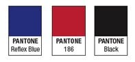
SPOT COLORSIn 3-color printing applications the logo should print in the Pantone (PMS) colors illustrated on left.
|
||||
4 – COLOR PROCESSIn 4-color applications the logo should always print in color using the 4-color process formulas listed here.
|
||||
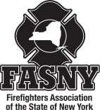
ONE COLORIf printing is limited to 1-color the logo should print in black. Exceptions should always be approved by FASNY Corporate Marketing. Please send an email to: Paul Oehmler at poehmler@fasny.com
|
||||
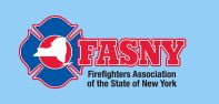
FULL- COLOR ON COLORThe full-color FASNY logo should preferably appear on white. If a white background is not available—a lighter background is recommended that doesn’t competes with the readability of the mark. Points to NOTE — FASNY Logo Distribution
|
||||
LOGO WITH REVERSED TAGLINE WHITEIt is preferred to have the logo print positive rather than reversed. The logo’s tagline may reverse to white if there is no other option available—provided the background color offers sufficient contrast for clear readability.
|